Crowdsourced Map
Real-world cellular data collected by CoverageMap users, with two datasets: speed test results and signal strength measurements.
- Countries
- Over 30+ countries supported
- Carriers
- Over 100+ carriers supported
- Datasets
- Speed test and signal strength
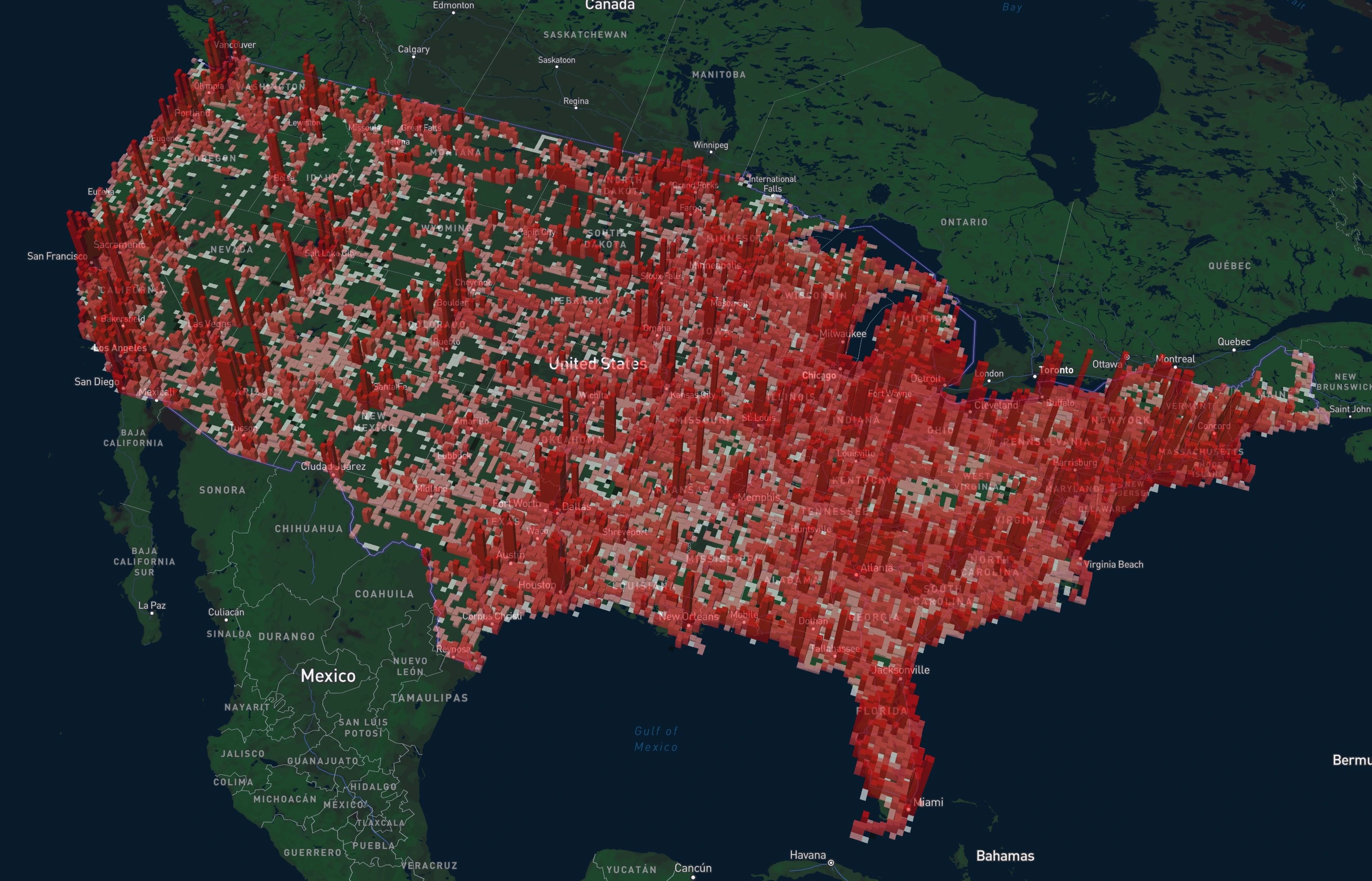
What is the Crowdsourced Map?
The Crowdsourced Map is a real-world view of cellular networks built entirely from speed test and signal strength measurements contributed by CoverageMap app users. Data uploaded to CoverageMap.com is processed in real-time and displayed on the map as squares.
Switch between the speed test and signal strength datasets to see either how fast a network performs or how well it is received, then click any square for detailed results and carrier comparisons.
- Two datasets: speed test results and signal strength readings
- Real-time map updates as users contribute data
- Powerful filters and color modes for custom map views
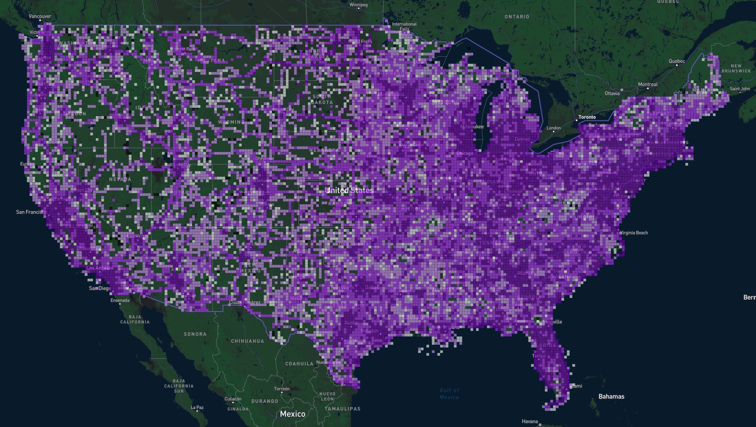
Two Crowdsourced Datasets
Every measurement comes from a real device on a real network. Choose the dataset that answers your question.
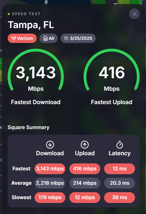
Speed Test
Download, upload, and latency
Speed tests run in the CoverageMap app are processed in real-time and displayed as squares on the map. Click any square to see the fastest, average, and slowest speeds recorded at that location.
- Download speed
- Upload speed
- Latency
Contribute from iOS and Android
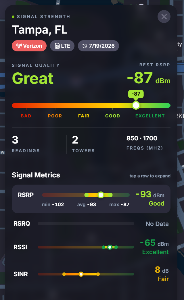
Signal Strength
Measured reception from real devices
Signal strength readings collected by the CoverageMap app show the reception users actually get, rather than the coverage carriers predict. Click a square for signal quality, tower counts, and the frequencies in use.
- RSRP and RSRQ
- RSSI and SINR
- Frequencies and Towers
Contribute from Android only
Powerful Filters
Filter by carrier, network technology, speed thresholds, date, and frequency (signal strength only) to focus on what matters most to you.
Filter by Carrier
Compare all carriers available in every country directly on the map, side by side.
Filter by Network Technology
View LTE, and 5G layers to track rollout progress and availability.
Filter by Data Speeds
Set download and upload speed thresholds to highlight only high-performing areas.
Filter by Quarter
See how performance evolved for each quarter over the last 5 years.
See Your Contributions
See the speed tests and signal readings you've contributed on your own dedicated map.
Filter by Frequency
Narrow signal strength readings to specific frequency bands. Available for the signal strength dataset only.
Three Helpful Color Options
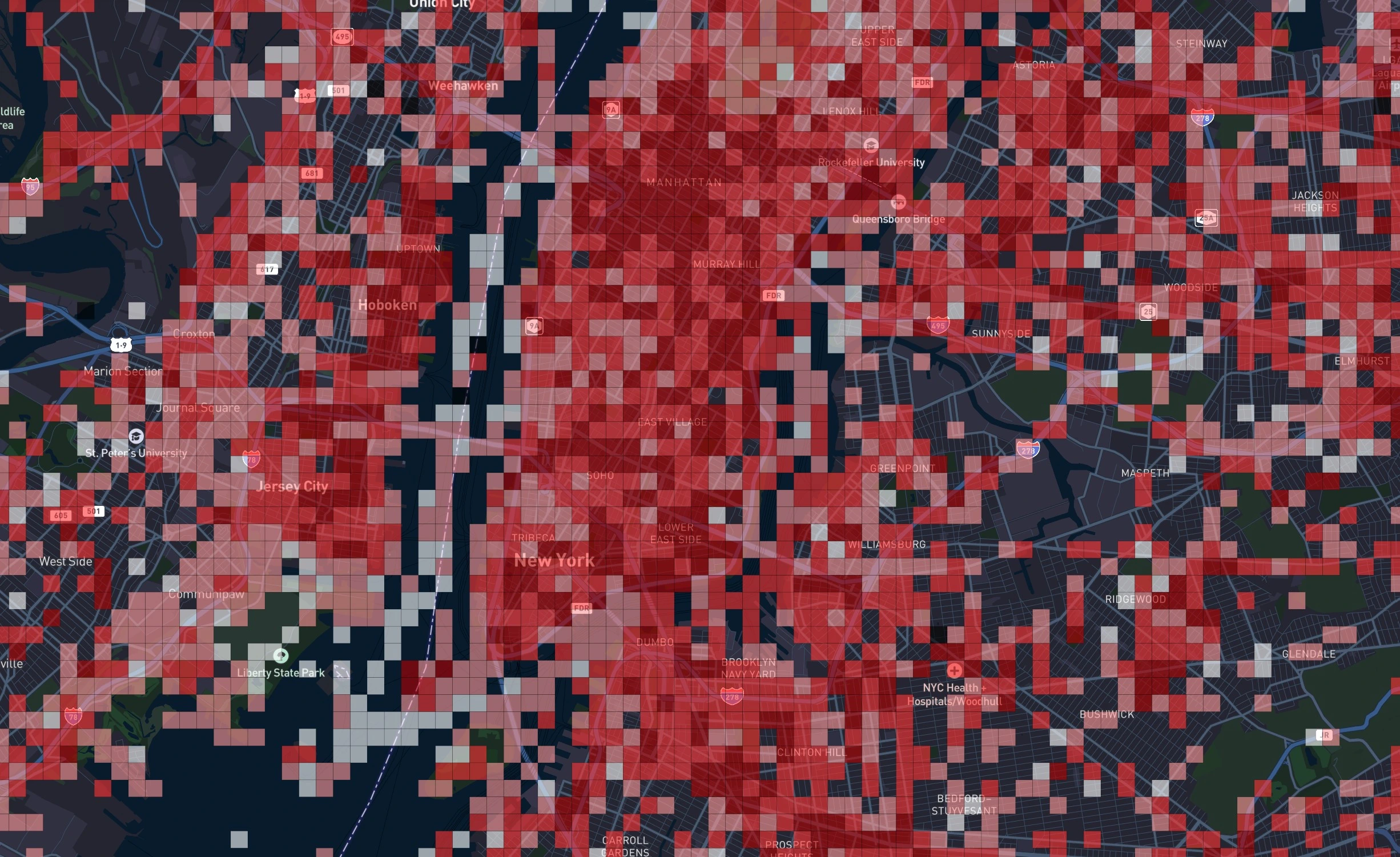
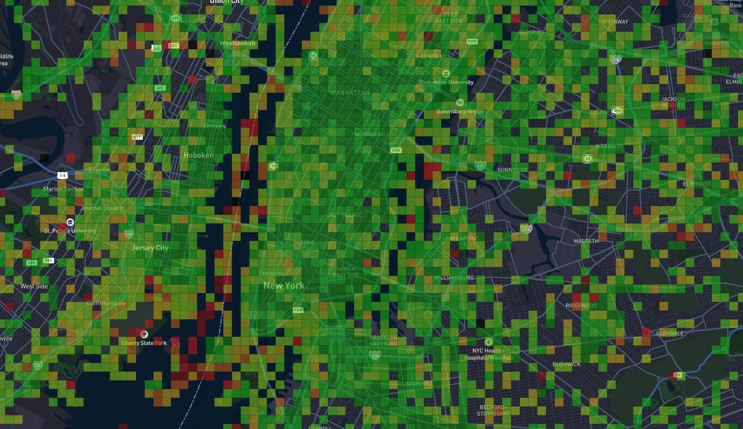
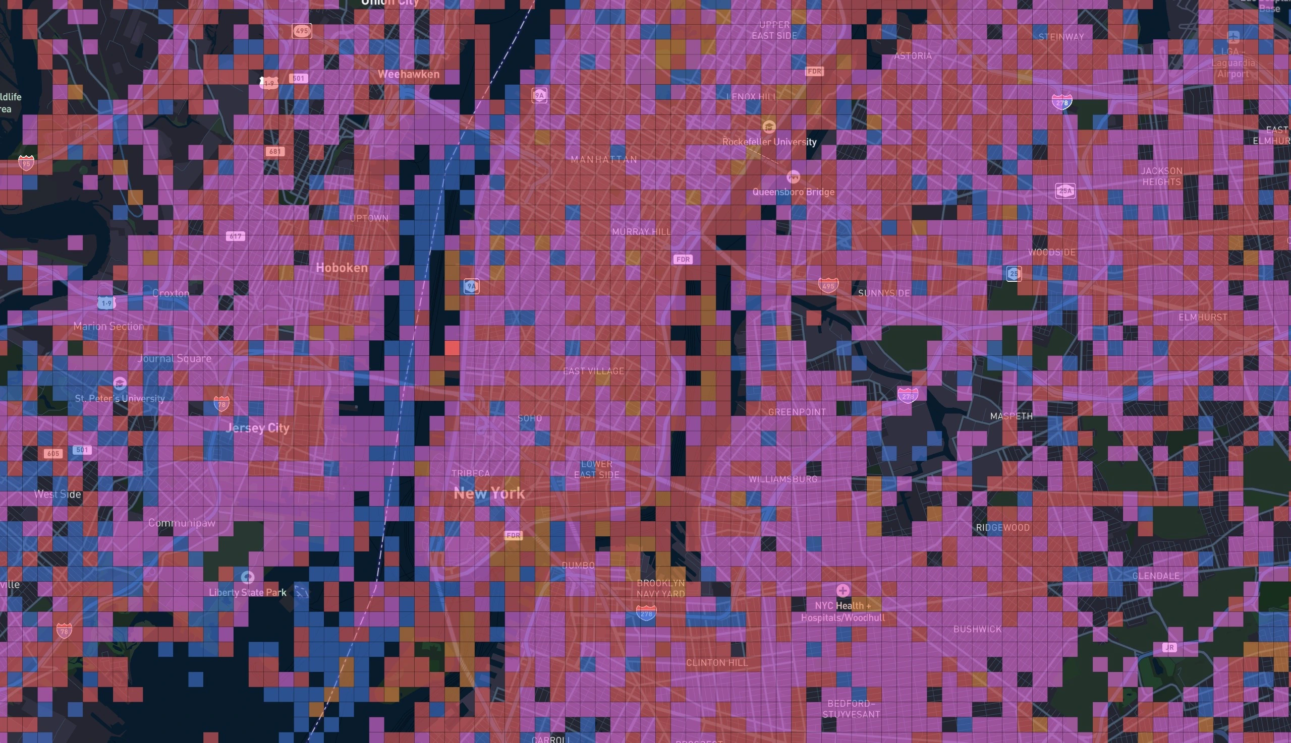
Choose the view that fits your workflow: Default, Heat Map, or Best Carrier.
How can you contribute?
Users run speed tests and upload real-world performance data. As new tests come in, the map updates in real-time to give everyone a clearer picture of coverage quality.
Create a free account
Create a free account to unlock your personal map, leaderboard points, and achievements.
Run tests
Run tests in the free Coverage Map app. Results are processed in real-time and appear on the map in minutes.
Explore the map
Compare network performance, apply custom filters, and see which carriers perform best in your area.